
| Profile Plot | |
This tool is available only if vector data is present in the product. Then, the Profile Plot may operate in two modes, the classic mode relying on a geometric shape, and the correlative mode which allows the user to compare satellite data to in-situ data. Both modes are thoroughly described below.
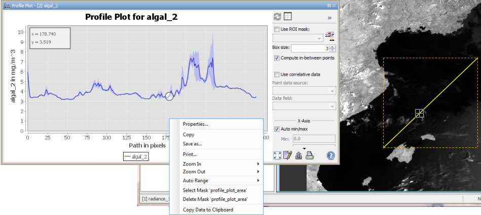
The screenshot above displays how the profile plot works for geometries: the values on the x-axis are given by the path length, that is, for a path containing 300 pixels there are 300 x-values. The domain axis is determined by the currently selected band. The plot displays the value of the currently selected band along the bounds of a geometry; in case of the screenshot, the values of algal_2 along a transect are displayed.
The blue shade around the plot line indicates the standard deviation (see http://en.wikipedia.org/wiki/Standard_deviation#With_sample_standard_deviation) of the selected band pixel within a square box. The edge length of that square box can be set to any odd value between 1 and 101.
The profile plot can be run in a mode that allows the user to map the current position within the band image to the position within the plot. This mode is entered when the user clicks into the plot, and left when the user clicks into the tool window, but somewhere outside the plot. In the upper screenshot, the current position within the image is at pixel #178 of the transect, where the value of algal_2 is 3.519.
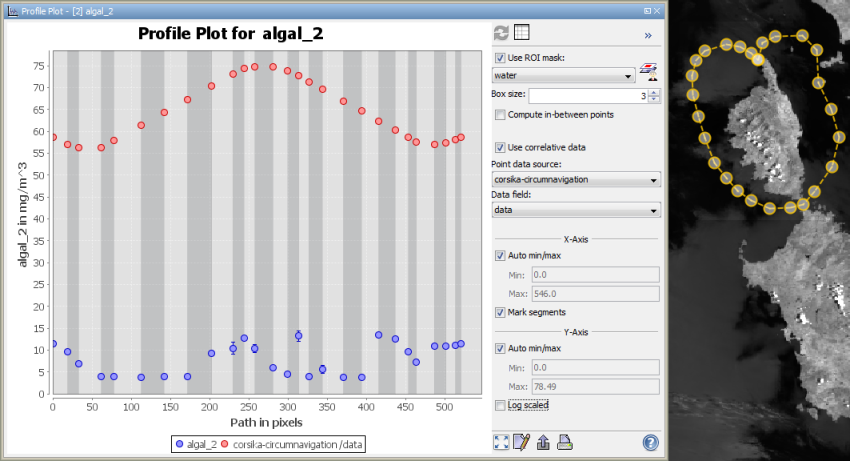
The screenshot displays the other features the profile plot offers. Note that there are some different tunings of the dialog: Most importantly, correlative data is being used. Additionally a ROI mask is being used, no in-between points are computed, and segments are marked. These features are described below separately.
Using correlative data means that vector data may be displayed within the plot in order to make satellite data
comparable to external data. When the option is chosen, some vector data source may be chosen from the 'Point data
source' dropdown list, and if it contains numerical data, the source for the numerical data may be chosen from the
'Data field' dropdown list. After that, two plots are displayed in the chart: the first one (in the lower screenshot, it's
the blue one) displays the values of the selected band at each pixel given by the vector data, while the second one
(screenshot: the red one) displays the values of the selected data field.
A ROI mask may be used to mask out values from the profile. All values which do not match the mask are not taken
into account. In the example of the lower screenshot, only pixels that match the mask water are considered. For
convenience, the mask manager may be openened from the profile plot window using the
![]() -button.
-button.
When the checkbox 'Compute in-between points' is marked, the points the satellite data plot contains are connected.
For each pixel of the geometry the value appears in the plot if the checkbox is marked, whereas only the
end-points of the geometry are considered if the checkbox is not marked.
Note that now the standard deviation is no more painted as blue shade around the plot line but as error bars around
the points in the plot.
The checkbox has no effect on the display of correlative data.
When the checkbox 'Mark segments' is active, the different segments in which the considered geometry can be decomposed are marked by shades in the background of the plot. See the lower screenshot for an example.
When you click ![]() you can switch to a Table View which provides information about the data displayed in the plot.
From there, you will be able to switch back to the profile plot.
you can switch to a Table View which provides information about the data displayed in the plot.
From there, you will be able to switch back to the profile plot.
A click with the right mouse button on the diagram brings up a context menu which consists of the following menu items: